Backstage part 2 - Personalized Homepages with Backstage
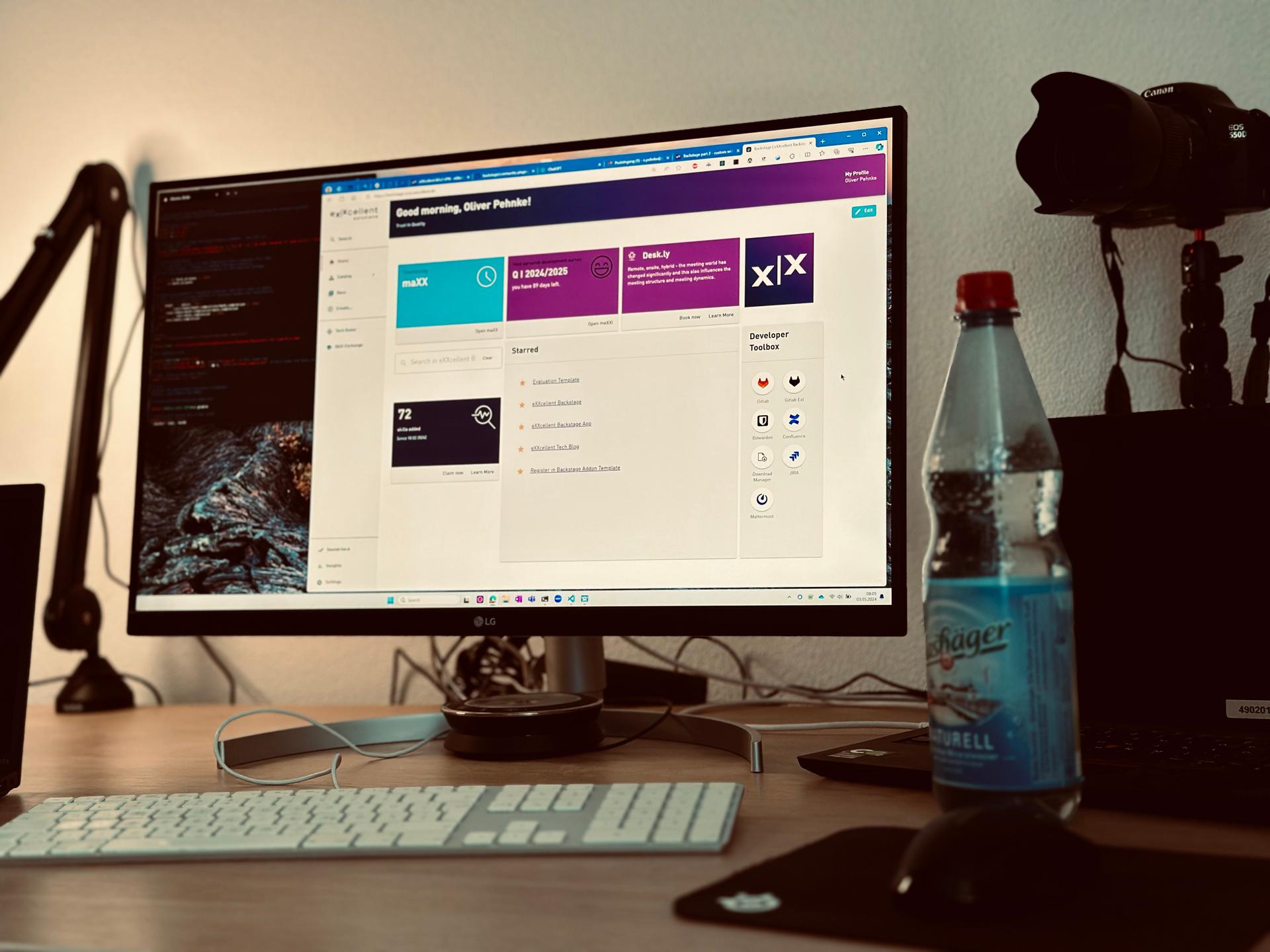
The homepage typically receives the highest traffic on a website, making it crucial to provide key information for frequent users while also appealing to newcomers with simpler content. Imagine having a default homepage that you can customize as your needs evolve over time.
One solution is a user customizable homepage. Luckily Backstage already offers creating such a user customizable homepage with the home plugin.
Goal
This article will guide you through the process of adding a customizable homepage (often abbreviated as p13n) in Backstage. We'll also create a dynamic widget that displays the balance of booked hours from our internal time tracking tool. This transformation will evolve the static homepage into an interactive dashboard.
Step 1 - A p13n Homepage
In the year 2022 spotify proposed a new plugin that helps creating your homepages from a set of components that fit into the backstage user experience. These are components like a Searchbar, Dialog, Logviewer, Logo, a Toolbox. Check them out in the storybook.
To use these components, just open HomePage.tsx:
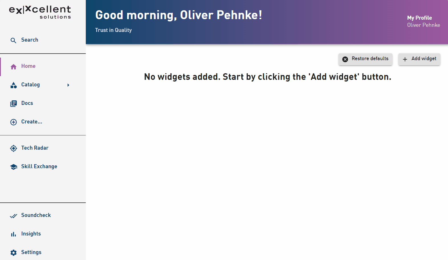
export const HomePage = () => {
    return (
        <Page themeId="home">
            <Header title={<WelcomeTitle language={['English']}/>}
                    pageTitleOverride='Backstage'>
            </Header>
            <Content aria-label="homepage">
                <CustomHomepageGrid config={defaultConfig} rowHeight={8}>
                    <HomePageSearchBar />
                </CustomHomepageGrid>
            </Content>
        </Page>
    );
};
The CustomHomepageGrid is a react component that will give the user the freedom to add widgets and remove (in our case only the search bar) and a drag and drop experience to arrange them in a defined grid. It will handle the loading and storage of the user settings in the local storage of the browser.
 ;
;Step 2 - Customized widgets
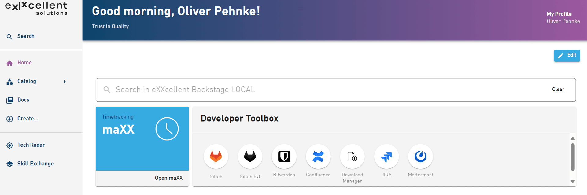
The home plugin comes with a bunch of widgets, such as a favorites list, the toolbox and more. To add the toolbox widget it must be added as child of the CustomHomepageGrid:
export const HomePage = () => {
    return (
        <Page themeId="home">
            <Header title={<WelcomeTitle language={['English']}/>}
                    pageTitleOverride='Backstage'>
            </Header>
            <Content aria-label="homepage">
                <CustomHomepageGrid config={defaultConfig} rowHeight={8}>
                    <HomePageSearchBar />
                    <HomePageToolkit
                        title='Developer Toolbox'
                        tools={[
                            {
                            label: 'Gitlab',
                            url: 'https://gitlab.exxcellent.de/',
                            icon: <GitlabLogoIcon />
                            }
                        ]
                        }
                    />
                </CustomHomepageGrid>
            </Content>
        </Page>
    );
};
Step 3 - A timetracker widget
We've developed a React component for our Maxx time tracking tool, featuring some static text and a button. To integrate this component into the CustomHomepageGrid as a widget, it needs to be encapsulated with an extension for the home plugin. Extensions are what plugins export for use in an app or plugin, see https://backstage.io/docs/plugins/composability/#extensions.
import { homePlugin } from '@backstage/plugin-home';
import { createReactExtension } from '@backstage/core-plugin-api';

export const MaxxHomepageComponent = homePlugin.provide(
  createReactExtension({
    name: 'MaxxHomepageComponent',
    component: {
      lazy: () =>
        import('./components/MaxxComponent/MaxxInfoCard').then(m => m.default),
    },
    data: {
      'home.widget.config': {
        layout: {
          width: { defaultColumns: 2, minColumns: 2 },
          height: { defaultRows: 12, minRows: 12 },
        },
      },
    },
  }),
);
The wrapper also has properties to define layout defaults using the key 'home.widget.config'. This enables you to restrict the size and define a meaningful default size.
Now we can simply add the widget by its new name MaxxHomepageComponent to the CustomHomepageGrid to make it available to the users:
export const HomePage = () => {
    return (
        <Page themeId="home">
            <Header title={<WelcomeTitle language={['English']}/>}
                    pageTitleOverride='Backstage'>
            </Header>
            <Content aria-label="homepage">
                <CustomHomepageGrid config={defaultConfig} rowHeight={8}>
                    <HomePageSearchBar />
                    <HomePageToolkit
                        title='Developer Toolbox'
                        tools={[
                            {
                            label: 'Gitlab',
                            url: 'https://gitlab.exxcellent.de/',
                            icon: <GitlabLogoIcon />
                            }
                        ]
                        }
                    />
                    <MaxxHomepageComponent />
                </CustomHomepageGrid>
            </Content>
        </Page>
    );
};
 ;
;Step 4 - A dynamic timetracker widget
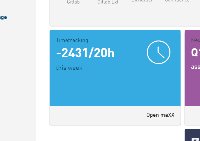
Given that users often visit the homepage, displaying essential data without requiring clicks into tools offers a significant advantage in drawing more traffic to the developer portal. Therefore, the timetracker should prominently feature booked hours and the weekly target hours, such as "12 / 37h".
A frontend plugin
We will start by creating a frontend plugin in backstage using the backstage cli in the project root folder yarn new. The new frontend plugin will have the name home-cards makes it easy to add all dependencies we need to log into the timetracking server using the OAuthAPI and get the data using the FetchApi.
MaxxInfoCard source code
import * as React from 'react';
import CardActions from '@mui/material/CardActions';
import CardContent from '@mui/material/CardContent';
import Typography from '@mui/material/Typography';
import {  Theme, makeStyles, useTheme } from '@material-ui/core';
import Clocksvg from './clock-2.svg';
import { InfoCard, LinkButton } from '@backstage/core-components';

import useAsync from 'react-use/lib/useAsync';
import { Progress } from '@backstage/core-components';
import { MaxxInterimSummary} from '../../api/MaxxApi';

import { configApiRef, featureFlagsApiRef, useApi } from '@backstage/core-plugin-api';
import { maxxApiRef, formatDate } from '../../api';
import { FeatureFlagged } from '@backstage/core-app-api';

const useStyles = makeStyles<Theme, { fontColor: string; backgroundImage: string }>(theme => ({
  cardContent: {
    color: theme.palette.background.default,
    backgroundColor: '#35abe2',
    height: '80%'
  },
  cardActions: {
    height: '20%'
  },
  cardIcon: {
    padding: '10px',
    float: 'right',
    height: 'auto',
    width: '80px',
  }
}));

type MaxxInfoCardContentProps = {
  maxxBaseUrl: string;
  maxxUserId?: string;
  bookedHours?: number;
  targetHours?: number;
}

const MaxxInfoCardContent = (value: MaxxInfoCardContentProps) => {
  const backstageTheme = useTheme<Theme>();
  const styles = useStyles({
    fontColor: backstageTheme.palette.primary.main,
    backgroundImage: backstageTheme.palette.infoBackground
  });
  const currentDate = formatDate(new Date());

  return (
    <InfoCard noPadding variant='fullHeight'>
      <CardContent className={styles.cardContent} aria-label="Maxx">
        <img className={styles.cardIcon} src={Clocksvg} alt="Clock Logo" />
        <Typography sx={{ fontSize: 14 }} color="text.secondary" gutterBottom>
          Timetracking
        </Typography>
        {value.bookedHours && <Typography variant="h3" component="div">
          {value.bookedHours}/{value.targetHours}h
        </Typography>}
        {value.bookedHours && <Typography sx={{ mb: 1.5 }} color="text.secondary">
          this week
        </Typography>}

        {!value.bookedHours && <Typography variant="h3" component="div">
          maXX
        </Typography>}

      </CardContent>
      <CardActions className={styles.cardActions}>
        <LinkButton target="blank" to={`${value.maxxBaseUrl}/app/bookings/current/daily/${currentDate}`}>Open maXX</LinkButton>
      </CardActions>
    </InfoCard>
  )
}

export default function MaxxInfoCard() {
  const maxxApi = useApi(maxxApiRef);
  const configApi = useApi(configApiRef);
  const baseUrl = configApi?.getString('home-cards.maxxBaseUrl');

  const { value, loading, error } = useAsync(async (): Promise<MaxxInterimSummary> => {
    return await maxxApi.readInterimSummary();
  }, []);

  if (loading) {
    return <Progress />;
  } else if (error) {
    return <MaxxInfoCardContent maxxBaseUrl={baseUrl} />;
  }

  return (
    <MaxxInfoCardContent
        maxxBaseUrl={baseUrl}
        maxxUserId={value?.userId}
        bookedHours={value?.balances.FLEXTIME}
        targetHours={value?.targetWorkingHours} />
  );
}
The MaxxInfoCard uses the MaxxApi to read from the Maxx server. The ConfigApi is used to define the baseUrl in our app-config.yaml in backstage. The helper function useAsync is used to load the data from the MaxxApi while displaying a progress bar.
A new config value
Using the ConfigApi allows you to access anything from the config, that is defined.
In order to define a new config key and value you must extend the configSchema. If you dont extend the configSchema backstage will filter your data from the loaded config. Edit the package.json of our frontend plugin and add:
...
  "configSchema": {
    "$schema": "https://backstage.io/schema/config-v1",
    "title": "@backstage/home-cards",
    "type": "object",
    "properties": {
      "home-cards": {
        "type": "object",
        "properties": {
          "maxxBaseUrl": {
            "type": "string",
            "visibility": "frontend"
          }
        }
      }
    }
  }
This will allow you to add the following data to your app-config.yaml and read it as shown in the MaxxInfoCard.
home-cards:
    maxxBaseUrl: https://maxx.timetracker.de
Accessing the MaxxApi
The MaxxApi is implemented by the ``MaxxApiClient. A class that uses the ConfigApi, FetchApiandOAuthApi`.
The FetchApi serves as a wrapper for the Fetch API, utilizing Request and Response objects. Through the MaxxApiClient, the client logs in using an OAuth token and retrieves the requested data.
To obtain the access token, we leverage the OAuth server configured, which coincidentally aligns with the one used for backstage. Utilizing the OAuthApi, we retrieve a valid token with a specified scope, enabling Maxx to authenticate the user. The login process manages the authorization aspect, governing the privileges concerning the resources linked to the token. The access token empowers you to make requests on behalf of the user. If the user hasn't granted access to the provider and the requested scopes, they will be prompted to log in.
export class MaxxApiClient implements MaxxApi {
  private readonly configApi: ConfigApi;
  private readonly fetchApi: FetchApi;
  private readonly oauthApi: OAuthApi;

  constructor(options: MaxxApiClientOptions) {
    this.configApi = options.configApi;
    this.fetchApi = options.fetchApi;
    this.oauthApi = options.oauthApi;
  }

  async readInterimSummary(): Promise<MaxxInterimSummary> {
    const maxxApiUrl = this.configApi?.getString('home-cards.maxxBaseUrl')

    // 1. get an oauth accesstoken
    const accessToken = await this.oauthApi.getAccessToken("openid profile email");

    // 2. log into maxx, to authorize
    const loginUrl = `${maxxApiUrl}/login`;
    const result1 = await this.fetchApi.fetch(loginUrl, {
      method: 'POST',
      headers: {
        'Authorization': `Bearer ${accessToken}`,
        'Content-Type': 'application/json'
      }
    });
    const data = await result1.json();
    const userId = data.userId;

    ...

    return {
      ...data2,
      userId,
      accessDate
    };
  }
}
Wiring the dependencies
The MaxxApiClient uses classes that are provided in the plugin.ts from a factory.
export const homeCardsPlugin = createPlugin({
  id: 'home-cards',
  apis: [
    createApiFactory({
      api: maxxApiRef,
      deps: {
        configApi: configApiRef,
        fetchApi: fetchApiRef,
        oauthApi: exxcellentSSOAuthApiRef,
      },
      factory: ({ configApi, fetchApi, oauthApi }) =>
        new MaxxApiClient({
          configApi, fetchApi, oauthApi }),
    }),
  ],
  routes: {
    root: rootRouteRef,
  },
});
Using the new plugin in the app
Since the frontend widget does not call the homeCardsPlugin you can add it to the App.ts:
const app = createApp({
    ...
    plugins: [
       homeCardsPlugin
    ]
});
Result
The Maxx widget is now showing the requested information. It utilizes the backstage identity to obtain another OAuth token for logging in and fetching data on behalf of the user. Since we're accessing the service only from the frontend, we're considered a new client. Therefore, the Maxx server needs to support Cross-Origin Resource Sharing (CORS) headers, otherwise the browser would block the fetch. (Yes, it appears that the data from the test system is outdated)
 ;
;Conclusion
The home plugin offers an easy to use framework within backstage to make backstage a cozy place for everyone. Users can easily add the widgets they need and have the freedom to arrange them to create a personalized experience, making them feel at home.
If all your primary applications already utilize a single sign-on solution, you can leverage the APIs provided by Backstage, such as the OAuthApi, to simplify access on behalf of the user. This streamlines the authentication process and enhances user experience, because the user will see data without clicks while keeping the data secure within the apps.
We at eXXcellent belief that the key to a successful developer portal lies in its adoption by developers. Developers are typically resourceful individuals who utilize a variety of tools and are often hard to please. Any investment aimed at simplifying the developer's experience with the system is worthwhile, as it enhances the overall work environment. Since the dashboard's release, we've observed increased usage of Backstage. However, the most noteworthy aspect is that it has sparked new ideas for further improvements.
Image sources
The cover image used in this post was created by Oliver Pehnke under the following license. All other images on this page were created by eXXcellent solutions under the terms of the Creative Commons Attribution 4.0 International License