Backstage part 1 - corporate design theme

In 2023, we embarked on the journey of adopting Spotify's Backstage, aiming to enhance developers' overview and streamline development processes. Because nowadays, developers grapple with numerous platforms, tools, scattered documentation, and codebases. And thats the case for a single project. As our company expanded, the number of projects and team members increased, complicating the overview even further. But you need the overview to maintain effectiveness by collaborating with those developers that can help you.
Vision
Imagine having a single app to access all projects, technologies, and team members effortlessly. Perhaps this app even features a search function to quickly find the necessary skills. We took the initial steps towards this vision with Backstage.
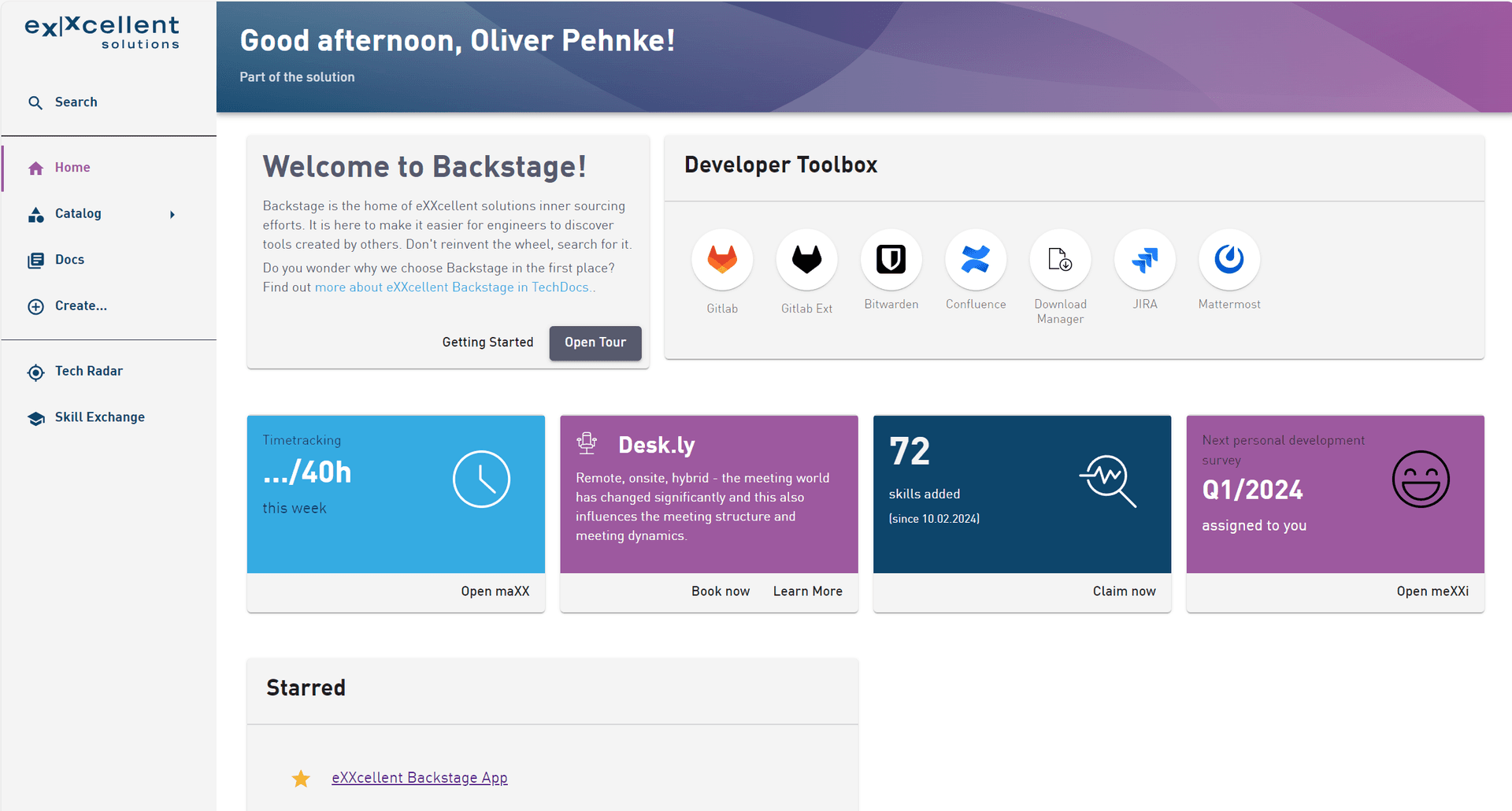
Our first objective right after implementing authentication was to instill confidence in the platform's output by establishing seamless integration and aligning its appearance with our corporate style. This began with the development of a tailored theme and homepage customization.
Logo
The logo is the most easy thing to change. Just replace the SVG file in the LogoFull.tsx and LogoIcon.tsx and its done.
Colors
To customize the appearance in Backstage, we began by creating a custom theme file rather than diving into CSS. We followed the instructions in the Backstage custom theme documentation, creating the file at packages/app/src/theme/ExxTheme.tsx. This theme builds upon the Backstage light theme, which itself is based on Material UI. Therefore, our task was to add color definitions for the palette entries to align with our corporate design that differed from the backstage theme.
Fonts
The next step was to incorporate our local font, which wasn't covered in the documentation. As Backstage indicated its use of the Material UI Theme API, we located the missing information here: Material UI Typography documentation and added our own font-face (see code below). Our fonts are stored in the packages/app/src/fonts folder as ttf files and referenced in the theme as MuiCssBaseline.styleOverrides. The fontFamily was changed to use DIN OT.
 ;
;import { createUnifiedTheme, genPageTheme, palettes, shapes } from '@backstage/theme'; export const exxTheme = createUnifiedTheme({ palette: { ...palettes.light, // based on light theme primary: { main: '#35abe2', // light blue }, secondary: { main: '#565a6e', // Darker blue grey }, error: { main: '#8c4351', }, warning: { main: '#8f5e15', }, info: { main: '#35abe2', }, success: { main: '#35abe2', }, background: { default: '#ffffff', paper: '#f4f4f4', // Light grey }, banner: { info: '#35abe2', // light blue banner error: '#8c4351', text: '#343b58', link: '#565a6e', }, errorBackground: '#8c4351', warningBackground: '#8f5e15', infoBackground: '#343b58', navigation: { submenu: { background: '#35abe2', // light blue }, background: '#f4f4f4', // Lighter grey indicator: '#9d599f', // lilac as indicator selectedColor: '#9d599f', // same as indicator color: '#0d456b', // dark blue for unselected items navItem: { hoverBackground: '#35abe2', // light blue }, }, }, pageTheme: { home: genPageTheme({ colors: ['#0d456b', '#9d599f'], shape: shapes.wave }), documentation: genPageTheme({ colors: ['#0d456b', '#9d599f'], shape: shapes.wave, }), project: genPageTheme({ colors: ['#0d456b', '#0d456b'], shape: shapes.wave, }), tool: genPageTheme({ colors: ['#9d599f', '#9d599f'], shape: shapes.round }), library: genPageTheme({ colors: ['#9d599f', '#9d599f'], shape: shapes.round, }), technique: genPageTheme({ colors: ['#9d599f', '#9d599f'], shape: shapes.round }), other: genPageTheme({ colors: ['#0d456b', '#9d599f'], shape: shapes.wave }), apis: genPageTheme({ colors: ['#0d456b', '#9d599f'], shape: shapes.wave }), }, fontFamily: '"DIN OT", Helvetica, Arial, sans-serif', components: { BackstageInfoCard: { styleOverrides: { } }, BackstageSidebarItem: { styleOverrides: { root: { textDecorationLine: 'none' } } }, MuiCssBaseline: { styleOverrides: ` @font-face { font-family: 'DIN OT'; src: url('../fonts/DINOT-Light.ttf') format('TrueType'); font-weight: 300; font-style: normal; } @font-face { font-family: 'DIN OT'; src: url('../fonts/DINOT.ttf') format('TrueType'); font-weight: 400; font-style: normal; } @font-face { font-family: 'DIN OT'; src: url('../fonts/DINOT-Medium.ttf') format('TrueType'); font-weight: 500; font-style: normal; } @font-face { font-family: 'DIN OT'; src: url('../fonts/DINOT-Bold.ttf') format('TrueType'); font-weight: 700; font-style: normal; } `, }, MuiButton: { styleOverrides: { root: { textTransform: 'none', // Remove uppercase text }, containedPrimary: { '&:hover': { backgroundColor: '#35abe2', // light blue on hover }, color: '#FFFFFF', }, containedSecondary: { '&:hover': { backgroundColor: '#35abe2', // light blue on hover }, color: '#FFFFFF', }, }, }, } });
in the packages/app/src/App.tsx we added the theme as following:
import { exxTheme } from './theme/ExxTheme';
...

const app = createApp({
    apis,
    components: {
        ...
    },
    bindRoutes({bind}) {
       ...
    },
    themes: [
        {
            id: 'exx-theme-light',
            title: 'Default eXXcellent light',
            variant: 'light',
            Provider: ({ children }) => <UnifiedThemeProvider theme={exxTheme} children={children} />,
        }
    ]
});
Entity page
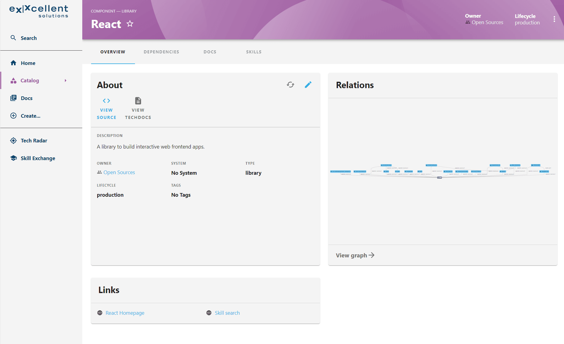
We've organized our projects into systems and components using the entity kinds, and categorizing technical dependencies like tools, libraries, languages, and techniques using entity types. This approach allows us to create components such as "React" typed as a "library," which serves as a dependency for a component of type project like our "Maxx time tracking" example. Want to learn more? Read the the detailed story as article in the news blog(in German language only).
 ;
;Colors
The theme (refer to the code above) assigns distinct colors to our types. These colors are applied in the header to aid navigation. For instance, a project component or system is represented by a dark blue hue, while a tool component adopts a lilac tone.
Features
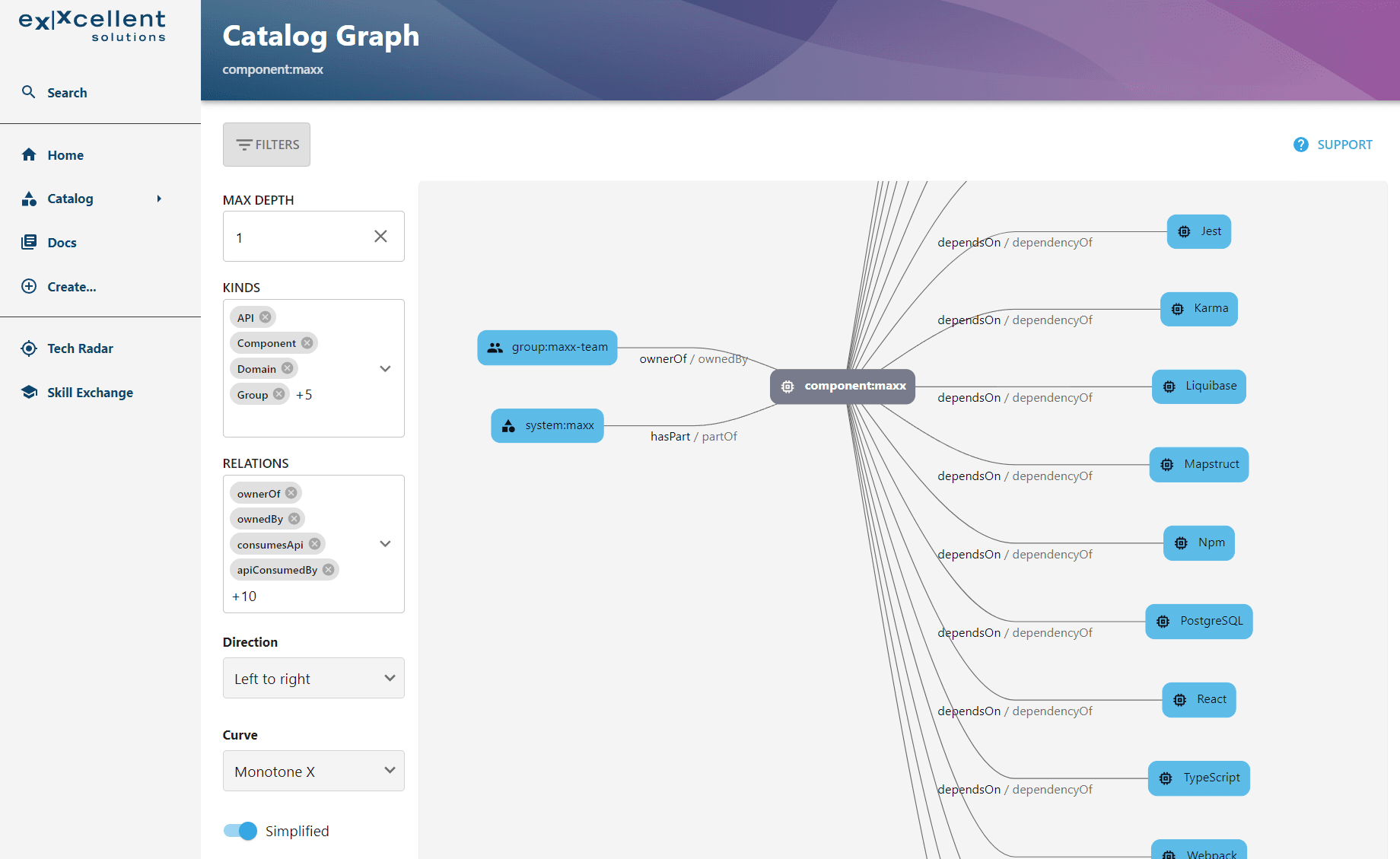
Each entity page is equipped with specific plugins tailored to our types. We've streamlined the default plugins per type to display only relevant content to the user. For instance, there's no necessity to showcase a SonarQube tab for a technical component like "React." And the graph view can be replaced by a list to display child components more readable.
 ;
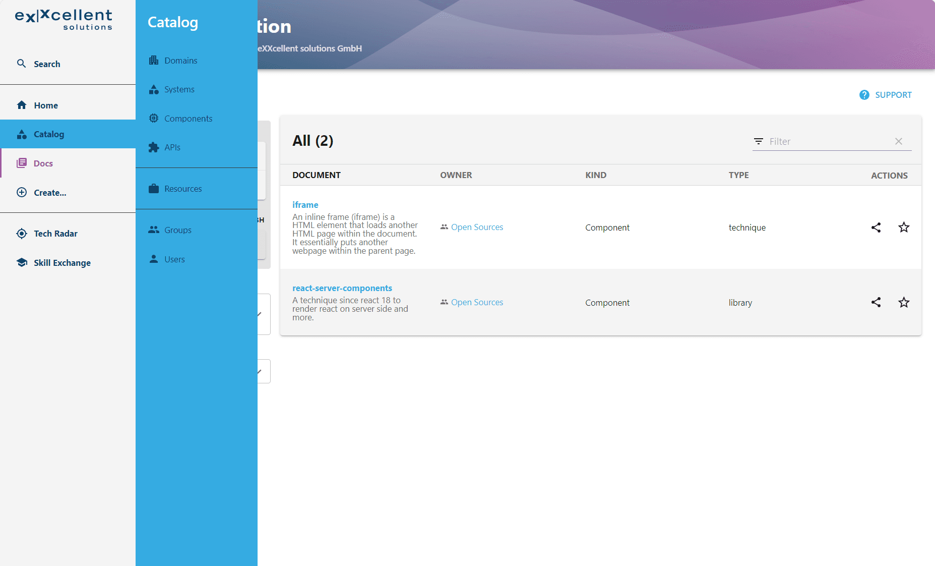
;Sidebar Submenu
We improved the sidebar by adding a submenu for the catalog, aiming to provide a more efficient overview of the most important types with just one click (domain, system, components, user). When users click on the components, we automatically apply a filter to assist novices, as our components are categorized by type.
packages/app/src/components/Root/Root.tsx
      <SidebarGroup label="Menu" icon={<MenuIcon />}>
        {/* Global nav, not org-specific */}
        <SidebarItem icon={HomeIcon} to="/" text="Home" />

        <SidebarItem icon={CategoryIcon} to="catalog" text="Catalog">
          <SidebarSubmenu title="Catalog">
            <SidebarSubmenuItem
              title="Domains"
              to="catalog?filters[kind]=domain"
              icon={useApp().getSystemIcon('kind:domain')}
            />
            <SidebarSubmenuItem
              title="Systems"
              to="catalog?filters[kind]=system"
              icon={useApp().getSystemIcon('kind:system')}
            />
            <SidebarSubmenuItem
              title="Components"
              to="catalog?filters[kind]=component&filters[type]=project"
              icon={useApp().getSystemIcon('kind:component')}
            />
 ;
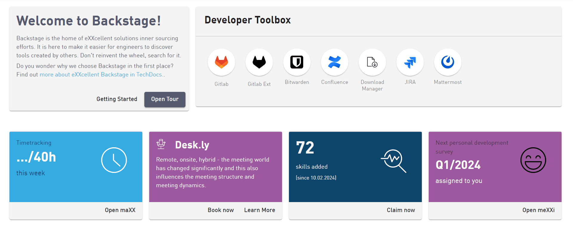
;Homepage
Backstage provides a selection of components built on Material UI, simplifying the creation of a custom home page. Our priority was to prominently feature the most commonly used tools on the page and enhance the user experience with dynamic data in the future. To achieve this, we developed custom cards, including the time tracking card.
Custom Cards
packages/app/src/components/home/MaxxInfoCard.tsx
import * as React from 'react';
import CardActions from '@mui/material/CardActions';
import CardContent from '@mui/material/CardContent';
import Typography from '@mui/material/Typography';
import { BackstageTheme } from '@backstage/theme';
import { makeStyles, useTheme } from '@material-ui/core';
import Clocksvg from './clock-2.svg';
import { InfoCard, LinkButton } from '@backstage/core-components';

const useStyles = makeStyles<BackstageTheme, { fontColor: string; backgroundImage: string }>(theme => ({
  cardContent: {
    color: theme.palette.background.default,
    backgroundColor: '#35abe2',
    height: '80%'
  },
  cardActions: {
    height: '20%'
  },
  cardIcon: {
    padding: '20px',
    float: 'right',
    height: 'auto',
    width: '100px',
  }
}));

export default function MaxxInfoCard() {
  const backstageTheme = useTheme<BackstageTheme>();
  const styles = useStyles({
    fontColor: backstageTheme.palette.primary.main,
    backgroundImage: backstageTheme.palette.infoBackground
  });
  return (
    <InfoCard noPadding variant='fullHeight'>
      <CardContent className={styles.cardContent}>
        <img className={styles.cardIcon} src={Clocksvg} alt="Clock Logo" />
        <Typography sx={{ fontSize: 14 }} color="text.secondary" gutterBottom>
          Timetracking
        </Typography>
        <Typography variant="h3" component="div">
          .../40h
        </Typography>
        <Typography sx={{ mb: 1.5 }} color="text.secondary">
          this week
        </Typography>
      </CardContent>
      <CardActions className={styles.cardActions}>
        <LinkButton target="blank" to='https://www.exxcellent.de/<path-to-maxx>'>Open maXX</LinkButton>
      </CardActions>
    </InfoCard>
  );
}
 ;
;Tour and Guides
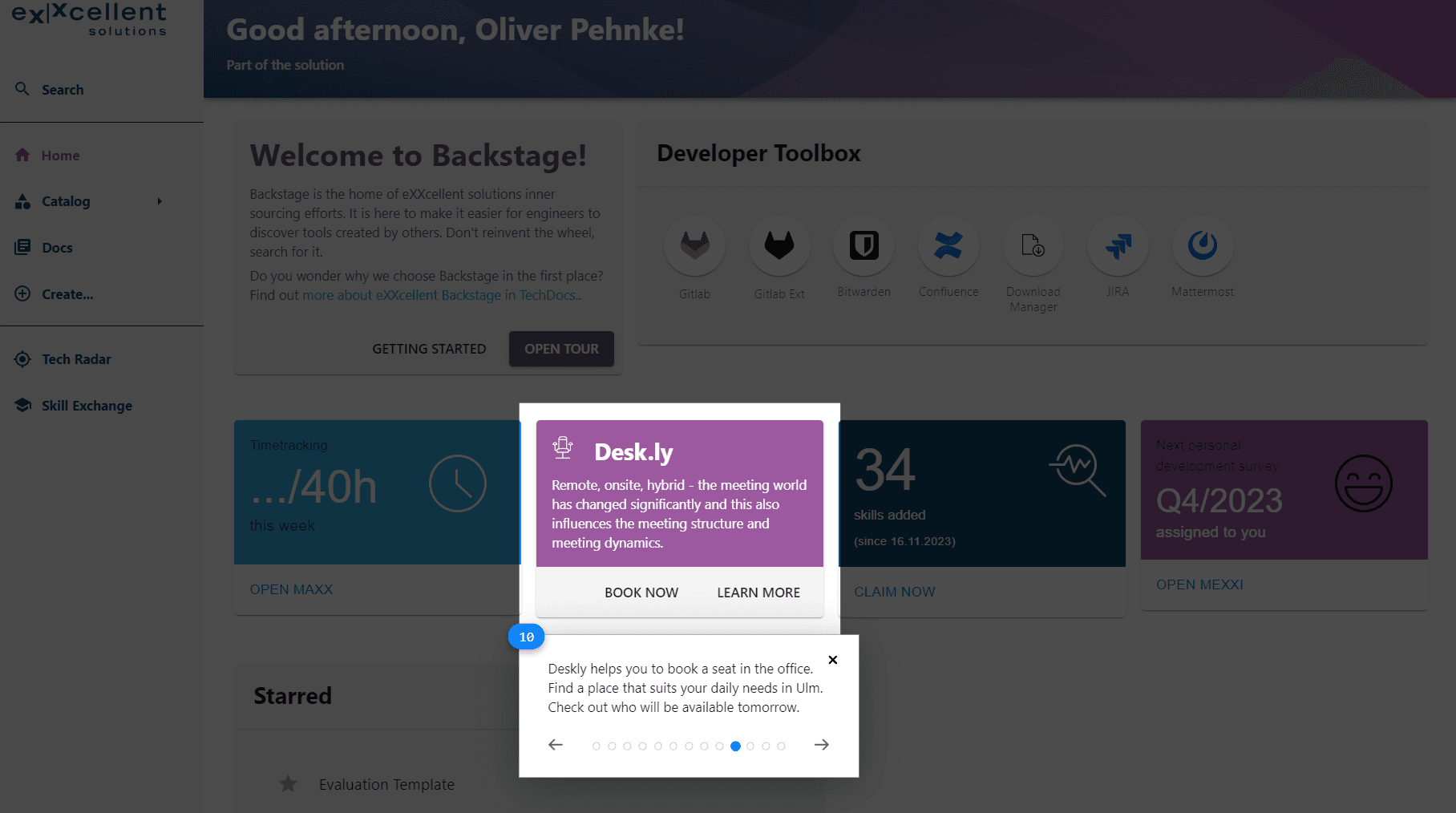
Backstage being a new tool, there's a learning curve associated with each of its features. We opted against traditional lecture-style classes and instead designed our self-service portal to be self-explanatory. However, since Backstage lacks built-in online help, we addressed this gap by incorporating a tour using @reactour/tour and providing links to the techdocs documentation with various guides to assist novices.
The tour walks users through prominent sections of the homepage, including the sidebar, providing explanations of each component's functionality.
 ;
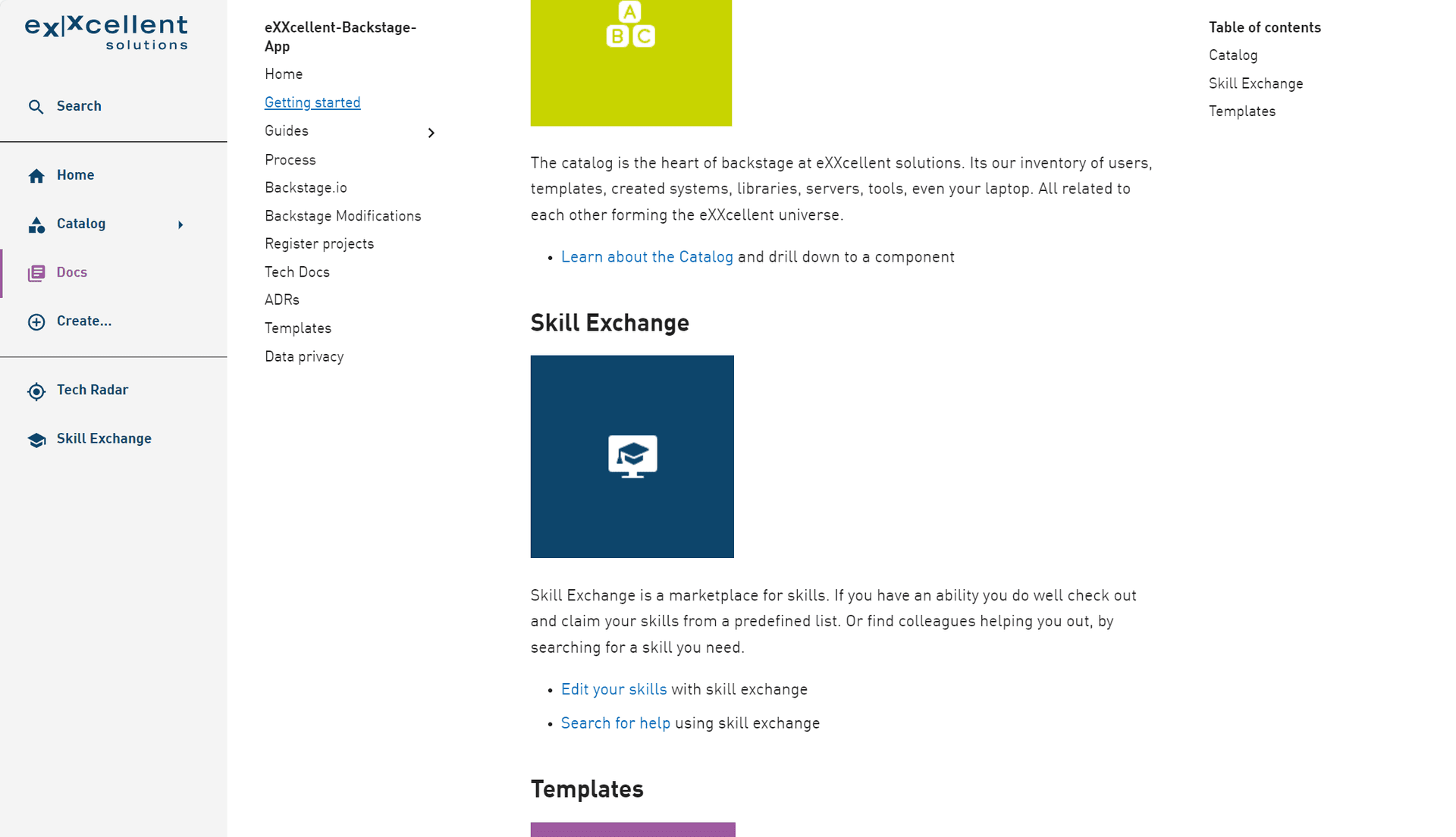
;The guides comprise a curated collection of markdown files sourced from Backstage TechDocs. Each guide outlines a specific use case and offers step-by-step instructions on utilizing a feature, such as the "how to find help based on technical components" or "How to add a project to the catalog".
 ;
;Summary
Customizing Backstage using TypeScript and React offers a seamless developer experience. The time invested in this customization is valuable as it results in a visually integrated tool that feels familiar to users, thereby easing its adoption.
Given that Backstage is another addition to the pile of tools already in use by developers, a primary objective from a user experience analysis is to ensure an enjoyable experience. This can be achieved by either minimizing the reliance on other tools (confluence, im looking at you) or by offering distinct benefits through the use of Backstage.
Such a benefit could be, that in comparison to a href to the time tracking tool, it shows a summary of working hours. Maybe in a future version we even add a "book now" that will start tracking without leaving backstage at all.
Learn more
The bigger picture how we structured the entity model to support our business model is available as article in the news blog (in German).
Image sources
The cover image used in this post was created by Kevin Ku under the following license. All other images on this page were created by eXXcellent solutions under the terms of the Creative Commons Attribution 4.0 International License